The Guide to Tweet-Sized Landing Pages
🎧 New episode of the pod is live with Chris Hutchins
I saw Chris on Tim Ferriss’ podcast and knew he had to come on mine.
We talked about how to turn a podcast into an empire. Pretty awesome convo.
YouTube (subscribe for exclusive videos like stealing my playbook to go viral)
Enjoy!
📖 The Guide to Tweet-Sized Landing Pages
When I tweeted my thesis around tweet-sized landing pages (TSLPs), it was only retweeted 100-something times…
…but 4,000 of you bookmarked it in hopes your competitors didn’t see it.
Sorry — this is just too good to keep a secret any longer.
TSLPs are basically conversion focused landing pages with 280 chars of max copy.
This goes against everything we’ve been taught about writing sales copy for the internet — yet I’ve seen conversions go up by 300% since implementing TSLPs into each of our products at Late Checkout.
We started with The Ultimate Guide to Unbundling Reddit and it’s worked like a charm.
Today, let’s dive deeper into tweet-sized landing pages and all of the components that make up a great one for your brand:
Mystery
Playfulness
Weird photo
Clear, cool CTA for a free item
1. Mystery
For this to work, you have to generate curiosity in 280 characters or less.
You want the user to feel like they urgently need to know what’s on the other side of the button.
2. Playfulness
The first bonus of a TSLP is to give the user less to read.
The second bonus is that reading the page is easy and fun.
People underindex on the power of fun and playfulness when it comes to conversions. If you sound greedy or robotic, it’s much harder to get someone’s full attention.
3. Weird Photo of You
I can’t believe this works, but it does.
I spent $1500/night to stay at Palm Heights in Grand Cayman just to get this picture, which sits on the landing page for my Ultimate Guide to Unbundling Reddit:
A unique photo of you, as a human, looking at the camera is an absolute must. It increases conversions like you wouldn’t believe.
4. Clear, cool CTA for a free item
Default never wins.
We’re numb to buttons that say subscribe, signup, or submit.
Smash this button to receive my free guide.
Dive into a whole new world.
Those are cheesy, but you get the point.
Pair this with a big button in a cool color that contrasts with the site’s background, and you’ll get more clicks.
Examples of TSLPs

I also saw Shaan Puri adopt his version of a tweet size landing page.
Why TSLPs will only get more popular
People are starting to see the value of giving away free stuff to earn trust. And TSLPs help you efficiently give away free stuff.
This is the rise of what I call Santa Claus marketing. The crux of this approach hinges on 2 simple truths:
1. People hate being sold to
2. Digital products cost $0 to create
When you give away high quality free items, trust skyrockets.
So to conclude…
Welcome to the future of sales: simple, effective, and surprisingly human.
❤️ Greg’s bookmarks:
5 things I found interesting this week:
The impending vertical software tsunami and‘The Laundromat Problem’. Super interested in vSaaS. Link
The minimalist branding has hit the App Store. It’s time to add color to your logos and products. Link
Breakdown of the Notion template industry using faceless accounts and low priced templates. I wonder what other ecosystems this could work for? Link
Living 5 mins walk from your friends skyrockets happiness and now there’s an app for that. So simple, so smart. Link
The 10% time tax for Solopreneurs by Nicolas Cole. Link, my pod with him last week Spotify, Apple, YouTube
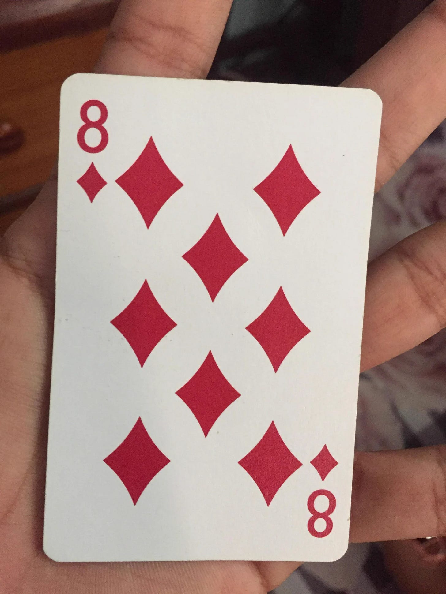
📷 Photo of the week: How old were you when you first noticed the "8" in the middle of the 8 of diamonds card?

👋 Ways to work together?
Solopreneurship is out, multipreneurship is in. Multipreneurship.com is live. We’re only letting in max 40 people into this but if you’re a top multipreneur, please apply. Read the website to see if it resonates.
Turn your ideas into designs that people love. Design has mega impact and we use Dispatch for all our businesses. Free to set up a call.
I jump into a few random sales calls sometimes too.
Work with Boring Marketers. I’m astonished how they can drive revenue using SEO. Free call and you might learn a thing or two about using AI-assisted SEO to bring revenue for your business. The Boring twitter is a must follow.


Love this idea! The simplicity is great and yes, the abhorrent traditional landing page, imo, is annoying and boring.
I guess there is zero SEO involved as that's not were the crux of your audience comes from (I guess social platforms/newsletter/etc). So it would probably only work if you already have credibility in the space you're in vs someone just starting out or creating a new product that needs their features highlighted